Python Pandas DataFrame.plot.bar() is used to plot the graph vertically in the form of rectangular bars. A bar plot is a plot in which, the categorical data with rectangular bars with lengths proportional to the values that they represent. A bar plot shows comparisons among discrete categories. In this article, I will explain DataFrame.plot.bar() function and using this how we can plot the Pandas DataFrame in a bar chart with several examples.
Key Points :
- A vertical bar chart is often called a column chart and it is referred to as the king of charts as it is most used.
- A bar chart is used to display a collection of categories on one axis and another axis represents measured value.
- The height of the bar is depending upon the measured value.
- In a vertical bar chart, the X-axis will represent categories and Y-axis will represent measured values. In a horizontal bar chart, it is the inverse
- Bar charts can be plotted vertically or horizontally.
- For negative values, in a vertical bar chart, the bars grow downwards below the X-axis.
- For negative values, in a horizontal bar Chart, the bars grow leftwards from the Y-axis.
1. Quick Examples of Plot Pandas DataFrame in Bar Chart
If you are in a hurry below are some quick Python examples of how to plot the pandas DataFrame in a bar chart by using DataFrame.plot.bar().
# Following are the quick examples

# Example 1: Draw a plot bar chart
df.plot.bar()

# Example 2: Get the individual column as a bar
df['death rate'].plot(kind="bar")

# Example 3: Set the labels and title
df['death rate'].plot(kind="bar")
plot.title("Death rate if corona virus")
plot.xlabel("Country")
plot.ylabel("Death Rate")

# Example 4: Rotate the x-labels by 30 degrees,
#and keep the text aligned horizontally
df['death rate'].plot(kind="bar")
plot.xticks(rotation=45, horizontalalignment="center")
plot.title("Death rate if corona virus")
plot.xlabel("Country")
plot.ylabel("Death Rate")

# Example 5: Get the Horizontal bar
df['death rate'].plot(kind="barh")
plot.title("Death rate of corona virus")
plot.ylabel("Country")
plot.xlabel("Death Rate")

# Example 6: Create unstacked bar
df.plot(kind="bar")
plot.title("Death rate if corona virus")
plot.xlabel("Country")
plot.ylabel("Death Rate")

# Example 7: Adding the stacked=True option to plot()
# creates a stacked bar plot
df.plot(kind="bar", stacked = True )
plot.title("Death rate if corona virus")
plot.xlabel("Country")
plot.ylabel("Death Rate")
2. Syntax of Pandas plot.bar()
Following is the syntax of the plot.bar().
# Syntax of plot.bar()
DataFrame.plot.bar(x=None, y=None, **kwds)
2.1 Parameters of the plot.bar()
x:(label or position, optional) Is used to allow the plotting of categorical data versus measured values. If not specified, the index of the DataFrame is used.y:(label or position, optional)Is used to allow the plotting of categorical data versus measured values. If not specified, all numerical columns are used.**kwds :Additional keyword arguments.
2.2 Return Value
matplotlib.axes.Axesornp.ndarray.
3. How to use Plot Bar Chart in Pandas?
The pandas DataFrame class in Python has a member plot() that is used to draw various diagrams for visualization including the Bar Chart. Pandas provides different representations for showing the data in the form of graphs. One of the important diagrams is a Bar Plot which is rapidly used in many applications and presentations.
We can make bar charts quickly and easily with the data from Pandas DataFrames. The bar graph is one of the best for fast data exploration and comparison of variable values between different groups. The main purpose of bar charts or bar plots is to attract user’s eyes by providing a clear look for the ability to compare the length of the objects.
Use plot.bar() to create vertical bar charts and use plot.barh() to create horizontal bar charts. These both methods take X and Y as parameters. By default, X is the index of the DataFrame and y is all the numeric columns.
In order to customize the bar chart, we have to pass any keyword argument to the bar() or barh() methods. Any keyword arguments supported by the method DatFrame.plot(). Suppose, the keyword argument title places a title on top of the bar chart.
By default, the index of the DataFrame or Series is placed on the x-axis and the values in the selected column are placed as bars. Every Pandas bar chart works this way and any additional columns become new sets of bars on the chart.
4. Create Plot Bar with Labels from Pandas DataFrame
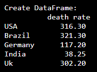
We can create a bar graph by calling a plot.bar() on the pandas DataFrame, so let’s create Pandas DataFrame. Here I have created a single column DataFrame with the sample data of the worldwide death rate of covid-19 in the pandemic. I have taken a list of country names as an index, it is set on an x-axis label and death rate as a measured value, is set on a y-axis label.
# Create DataFrame
import pandas as pd

df = pd.DataFrame({"death rate":[316.3, 321.3, 117.2, 38.25, 302.2 ]},
                  index = ["USA", "Brazil", "Germany", "India", "Uk"])
print("Create DataFrame:\n",df)

# Draw a plot bar chart
df.plot.bar()
Yields below output.
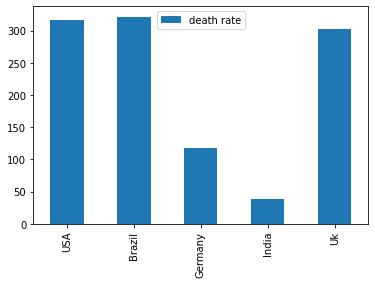
We can use the below syntax and get the individual columns on a plot bar of a given DataFrame.
# Get the individual column as a bar
df['death rate'].plot(kind="bar")
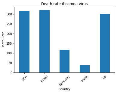
5. Set the Axes Labeling & Set Plot Titles
Let’s give labeling of the x and y axis and set the title in a bar graph, this gives us a better readable bar plot. In order to do so, I will use the Pandas plot() method. By using this generic plot() method we can customize the graph. Labeling of the axis is done by using the Matplotlib object imported from pyplot.
xlabel: It is used to set the label of the x-axis.ylabel: It is used to set the label of the y-axis.title: Using this we can set the title of bars
# Set the Bar Plot Labels and Title
import matplotlib.pyplot as plot
df['death rate'].plot(kind="bar")
plot.title("Death rate of corona virus")
plot.xlabel("Country")
plot.ylabel("Death Rate")
Yields below output.

6. Rotate the x-axis Labels
If we have long labels, it will be too clumsy to see, to reduce this problem plot bars provide two options. The first option is by rotating the labels to make them more specious and another option is rotating the entire chart to end up with a horizontal bar chart.
# Rotate the x-labels by 30 degrees, and
# keep the text aligned horizontally
df['death rate'].plot(kind="bar")
plot.xticks(rotation=45, horizontalalignment="center")
plot.title("Death rate of corona virus")
plot.xlabel("Country")
plot.ylabel("Death Rate")
Yields below output.
7. Horizontal Bar Charts in Pandas
Using horizontal bars we are able to give an extra long bar title. Horizontal bar charts are reversed to vertical bars. Here, categories are drawn in x-axis and the measures values are drawn in y-axis whereas horizontal bars categories in y-axis and measured valuers are in x-axis. Horizontal charts are allowed in Pandas by set the kind parameter to barh.
Here, I will plot the given pandas DataFrame in the form of a horizontal bar by using DataFrame.plot(kind="barh"). Since I am labeling axes I have used the plot() method otherwise you should be able to use DataFrame.plot.barh() method.
# Get the Horizontal bar
df['death rate'].plot(kind="barh")

plot.title("Death rate of corona virus")
plot.ylabel("Country")
plot.xlabel("Death Rate")
Yields below output.
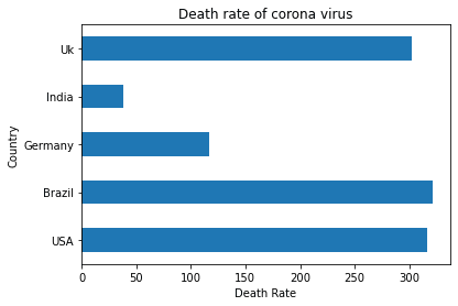
This plot is also called the horizontal bar plot and here we can see Brazil has got height death rate.
8. Stacked & Unstacked Bar Graphs
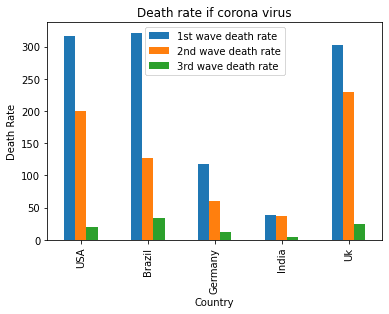
Using stacked and unstacked bars we can also compare columns of a given DataFrame and present them in a bar graph. For that, we need to create multiple columns in a DataFrame. Let’s create DataFrame with multiple columns.
# Create DataFrame
df = pd.DataFrame({"1st wave death rate":[316.3, 321.3, 117.2, 38.25, 302.2 ],
                   "2nd wave death rate":[200.1, 127.2, 60.1, 37.6, 230.1],
                   "3rd wave death rate":[20.1, 34.1, 12.1, 4.2, 24.3]},
                  index = ["USA", "Brazil", "Germany", "India", "Uk"])
print(df)
Yields below output.
# Output:
         1st wave death rate  2nd wave death rate  3rd wave death rate
USA                   316.30                200.1                 20.1
Brazil                321.30                127.2                 34.1
Germany               117.20                 60.1                 12.1
India                  38.25                 37.6                  4.2
Uk                    302.20                230.1                 24.3
8.1. Unstacked Bar Plots
Python Pandas un-stacked bar chart. If you select more than one column, pandas by default create an unstacked bar chart with each column forming a bar and the DataFrame index as the x-axis.
Use Unstacked bar plots to compare a particular category with different samples. As we can see from the below, it shows the death rate of coronavirus over the three waves.
# Create unstacked bar
df.plot(kind="bar")
plot.title("Death rate if corona virus")
plot.xlabel("Country")
plot.ylabel("Death Rate")
Yields below output.
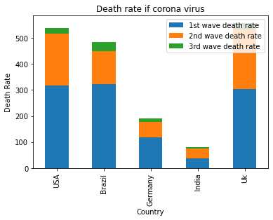
8.2. Stacked Bar Plots
Stacked bar charts show the total quantity of each group. Using stacked bar plots we can compare each individual. For, that we need to set the stacked keyword with the value True. Stacked bar plots have each plot stacked one over them.
# Adding the stacked=True option to plot()
# Creates a stacked bar plot
df.plot(kind="bar", stacked = True )
plot.title("Death rate if corona virus")
plot.xlabel("Country")
plot.ylabel("Death Rate")
Yields below output.
Frequently Asked Questions on Create Pandas Plot Bar
To create a basic bar plot using Pandas, you can use the plot.bar() method on a Pandas DataFrame or Series.
To create a horizontal bar plot using Pandas, you can use the plot.barh() method. For example, the key difference is the use of plot.barh() instead of plot.bar().
You can customize a bar plot in Pandas by using Matplotlib functions to modify various aspects of the plot, such as adding labels, a title, and more.
You can create a stacked bar plot in Pandas by using the stacked=True parameter in the plot.bar() method. df_stacked.plot.bar(x='Category', y=['Value1', 'Value2'], stacked=True, rot=0): The stacked=True parameter is used to create a stacked bar plot. The y parameter is a list of columns to be stacked on top of each other.
You can change the color of the bars in a Pandas bar plot by using the color parameter in the plot.bar() method.
You can add error bars to a bar plot in Pandas by using the yerr or xerr parameters in the plot.bar() method.
To save a bar plot created using Pandas to a file, you can use the plt.savefig() method from Matplotlib. For example, plt.savefig('bar_plot.png') saves the current figure to a file named “bar_plot.png” in the current working directory. You can specify a different file name or path and choose a different file format by changing the file extension (e.g., ‘bar_plot.pdf’, ‘bar_plot.svg’, etc.).
Conclusion
In this article, I have explained pandas DataFrame.plot.bar() is used to create a vertical bar plot, plot.barh() is used to create a horizontal bar plot. And also I explained the organization of the bar graph using various keyword arguments and explained stacked and unstacked plots when you have multiple columns on DataFrame.
Happy learning !!
Related Articles
- Change Pandas Plot Size
- How to Create Scatter Plot in Pandas?
- How to Generate Time Series Plot in Pandas?
- How to Plot the Boxplot from DataFrame?
- Pandas Explode Multiple Columns
- Pandas Add Column with Default Value
- Pandas Convert String Column To DateTime
- Pandas Find Row Values for Column Maximal
- Sum Pandas DataFrame Columns With Examples
- Create Pandas DataFrame With Working Examples
- Select Pandas DataFrame Rows Between Two Dates
- Select Rows From List of Values in Pandas DataFrame